


About This Class
Demystify the art of logo design with a simple, beginner-friendly process!
Logos are small symbols that tell big stories. As a graphic designer, it's your job to make that story as memorable as possible. That's where Shantanu Kumar comes in: as a designer and YouTuber, he's developed hundreds of logos for brands big and small. In this class, he breaks down his process step-by-step, sharing how to develop memorable logos using symbolism, color theory, and typography. It's a process he taught himself, and one anyone can replicate!
Working through a logo from start to finish, Shantanu shares how to:
- Research and use a creative brief to kickstart the design process
- Build a mind map and moodboard to guide your design
- Sketch then digitize your ideas to infuse your logo with an artistic touch
- Integrate color psychology for more visual impact
Plus, Shantanu shares his tips on differentiating between good and bad logo design, so your work stands up to the big brands and shines wherever it appears, from social to print to web.
As the centerpiece of brand identity design, logos are an essential ingredient in every successful designer’s portfolio. Whether you’re building that body of work, launching your own brand, or pitching client projects, Shantanu’s straightforward formula will give you the tools to tell brand stories in an artistic and impactful way!
This class is for anyone interested in exploring the fundamentals of logo design, especially beginner designers. Shantanu works in Adobe Illustrator, but all you need is pen, paper and any design software. Download the sample project brief to get started!
Shantanu Kumar is a brand identity designer & YouTuber based out of New Delhi, India. He melds his engineering background with his art to guide his style and has a passion for building brand materials and guidelines.
He has been working for the past 7 years now and has designed logos for brands like Sikkim Coffee, Prospeer and SmartGreen AquaCulture, to name a few. His unique perspective, along with his love for minimalism helps him come up with aesthetically appealing logos. With a camera in his hand & editing software at his disposal, he loves making YouTube content videos about his design process.


- Logo alone is not enough; it's also a part of a well-crafted band identity. A brand identity contains elements like colors, typography, photography, illustration.
- Three important factors of a logo:
- Memorable
- Distinctive &
- Efficient/Minimal
Research
- First step of designing a logo.
- Sikkim coffee is definitely my favorite. This project in specific was very research intensive. And the main idea of the research was to come up with the concept that would best represent the state and the people. I started by researching the architecture of the monasteries, studying things that are unique to the state, and also took inspiration from a stylus painting called tanker. I would say that research alone took about a month.
- Eventually, we settled on two concepts and decided to merge both of them. The first concept was Red Panda, which is the state animal of second. And the second concept was *pedian calligraphy. I merge these two concepts and created this logo for a second coffee.
- Every logo starts with a brief. If there's no brief, There's no direction. This is the client brief that we'll be working on today. In the brief had mentioned that Keq is creative club, is a co-working space and cafe based in New Delhi. They're looking for a logo to use for the cafe, app, marketing and other merchandise. It's a space dedicated to empowering creative professionals. The name of the space is inspired by 1989 Studio Ghibli classic film, quickest delivery service.
- According to the brief, the goals and missions are that they provide a safe space for credit people. It's a common comfortable environment. They help increase productivity without feeling burnt out.
- Help overcome creative blocks. The spacewalks on a subscription basis and falls on the premium side. They also do coffee takeaways for non-members. When a client sends you a brief, it's not really structured. So what I like to do is go onto my creative club boat and organize my information there. You can use Google Docs, pen, paper, whatever you're comfortable with. I like to use melanoma. It's a free software.
- It's like a digital whiteboard and it's somewhere I can organize all my files and information in one place. So I typed down all the information from the name of the brand to goals and missions of the brand.
- In all cases client brief is not adequate enough to start working on a design process directly. So what I like to do is have a lot of conversations with the client. I asked a lot of questions and try to understand the client's perspective on the brand. The main objective is to align yourself with the client's perspective and embody the spirit of the brand. This will help you save a lot of conflicts. Later on, I would recommend you to document everything that you discuss. The questions you ask can vary from project to project.
- But usually I like to begin with these four questions.
- Why do you exist?
- What's the purpose of your brand?
- What future do you want to create?
- What principles to guide this behavior?
- You can always give the clients examples to help them understand the questions better. For example, Oberth mission statement is transportation as reliable as running water for everyone, everywhere? In a similar fashion, I asked my client what their mission statement is, the short-term clearer your answer is the MOOC on Peter direction will be, I realized the more engaging my conversations are, the better understand the brand.
- You can then follow up by asking questions like who their competitors are and what other brands they inspired by. So after I have all the information and organize them on Macmillan art board. So I'll put down nodes for each of the questions that I've asked.So
- purpose,
- mission,
- vision, and
- values.
- Since I have the brief with me, I'll go ahead and copy the answers to these from my brief.
- Then I organize them into columns, let's say goals and mission. This can be my client information. I'll also go ahead and create a timeline for this project. So I'm gonna pick a checklists to-do list and then have the search mood board, sketching and final logo. For this, I can add a title here and call it my timeline, and add individual deadlines to each of the stages. Next, I'll go ahead and create boards for each of the important steps. I'll create another checklist for the deliverables. So in our case, it's logo, colors, color, palette, topography, and a final presentation.
- For any brand. It's important to understand who the target audience is. This is done after having conversation with your client. In our case for cookies creative club, I'll go ahead and create three user personas. User persona is basically a cactus sketch of what your ideal customer looks like. I'll drag down three nodes and give them a imaginary name.
- So let's say Kim droves. Inertia. And basically understand what my ideal customer would look like. So for me, all my customers would be creatives. Maybe Kim could be an art director, maybe drove, could be a freelancer, maybe Aneesh could be a content creator.
- One thing to note here is that it's important to mention your persona's and details. This will make sure that you have covered the entire target audience. I'll also write the age, what their hobbies could be. Now I'll dive into the deeper research.
- I watched the movie Keq is delivery service from which the name is heavily inspired by and better understood the reason behind it. The movie tells us about how failure is an inevitable part of a creative process.
- But most importantly, it's also temporary. Kiki, the main character tells us that if you stop having fun, then the magic will slip away Kiki straight. If club is a space designed to bring that magic bag and prevent burnout. Now, I'll go ahead and add all this information that I've gathered so far onto my melanoma board.
- When I add just a few more screenshots from the movie, I'm going to add a poster from the movie. I'm gonna write a more refined version of the message. So I look at Kiki delivery service message and then have this information onto my melanin board. Now moving on to the competitor analysis, while conducting research about my competitors, I looked for places where my target audience would usually be.
- So that would include coffee spaces and other co-working spaces in my area, personal experiences is also one way to do your competitor analysis to understand the company the better I conduct interviews with people in my circle. I like to ask them questions about what they like, how they work and what places the go-to. I like to see who they are as a brand, what their target audience is, what their pricing plan is, and what their design looks like.
- I usually take about two to three days in this process, having conversations with client is very important at every stage, just to make sure that you're on the same page. The client knows the industry better. He's the expert and you always want the expert's advice. So according to the brief, I know that my competitors are WeWork and double slash coffee. I started researching about them first.
- So they target audience is mostly startups and small businesses. So I'll do some more research on v work. I look up about their branding. Lot of creatives also work from the comfort of their home studios. So how do I convince them to come to cookies creative club, apart from other co-working spaces, even coffee shops can also be a competition.
- So that could be Starbucks, third wave coffee, or blue to k. I'm going to list all of this information onto my research board. You can also look for competitors and other countries and take inspiration from them. Now I'll go ahead and add all this information onto MNO. Not good. I feel like I'm done, so I'll move on to the next step that's refining my research into the mood board, your student exercise for this lesson is to conduct a research for the brief that's provided for you.
Mood boarding
- A mood board is a place where I collect all my reference images in one place. This has me visualize a mood for the brand. But before I move on to this process, I like to do a little exercise called mind-mapping.
- Mind mapping is a technique to generate ideas. I'll pick out some keywords from the research that I've documented in the previous lessons and then expand around them. So first I like keq is creative club in the center of my page. And then I'll brainstorm on the words that best fit with the brand. I'll further expand with some adjectives are synonyms around the worst that I've already noted down.
- These words will act as prompts from my mood board and also help in generating ideas for the logo. These prompts and make it easier for me to look for images that we create the mood for the design. I prefer to do the rough work on my notebook and then I filter out the words that I like onto my miller notebook. Now I'll filtered out five to ten words that I like and I'll use them as prompts for my mood board.
- I can just double-click or create a note, or I can drag a node from the left as well. My first five words that I want to use is magical, abstract, community, creativity, and stars. I feel like these five keywords somewhat capture the essence of the brand. I think I'll also add five more words. Does to be on the safer side. Align these words in a row. Magical. I use word like stars and Unreal. From abstract I want to add are out of the box. For community, I really like the feeling of 01:40 a family group of creatives.
- One word will lead to another and you can keep expanding. I feel then what suffice for me? I'll filter out a few Bill Woods and complete my mind map. Since I started looking for references, after picking out five to six words for my mind-map.
- References can be photos, texts, patterns, CD artwork, movie posters, or anything that conveys a particular mood that you're looking for. Websites like Pinterest, the hands and rebel at the best places to gather your references from. I like to use Pinterest because once you search a couple of votes, it starts recommending you more images in the same domain. I started looking for some words along the lines of maybe creative photography. I'll browse some of the photography and I can also sort something along the lines of TD, abstract artwork. After browsing, I came across this image that I like. Now I lose the melanoma Web Clipper extension and I'll save it onto my mood board. I feel like I've spent enough time on Pinterest now I want to move on to dribble.
- I personally like to use dribble because it has a very curated list of vector designs. So in Durban, I want to start looking for some patterns and posters and I start searching my keywords here quickly want to jump to Behance. So unlike Pinterest and dribble, you can find entire design projects here.
- I'm going to look for something that I feel will help create the mood that I'm looking for. So I feel like this is a good reference for the mood I'm trying to create. I'll go ahead and add a few more images until I feel like I have to wipe that I'm looking for to avoid deviating from the track too much, just keep checking back to the five to six keywords you started with using logos from a competitive brands for your moodboard is a big no-no.
- I try and avoid using logos in general for my mood boards because I don't want it to influence my design at such an early stage, I usually find what I'm looking for in about 30 to 40 reference images. So the goal is to group the similar ones together. I feel like this set of images give me a more casual vibe. Whereas this set of images give me a more modern than sophisticated.
- By once I have all the grouping done, I like to get feedback from the client and discuss if there's any rework necessary. It's very important for you and the client to be on the same page to avoid back-and-forth later on. So the time taken to create a mood board can vary. Some days I find everything I need within an hour. While some days I do get a creative block. You can also look for inspiration for your mood boards offline in books, graphic novels, or magazines. Don't feel restricted to Mellon node for creating a mood boards.
- Alternatively, you can also use Behance and Pinterest, or you can also create them directly on illustrator. Ya shouldn't exercise for this lesson is to start collecting all reference images and put them on your mood board. So in the next lesson, we'll start getting some ideas and concepts and digitize them on Illustrator.
Sketching
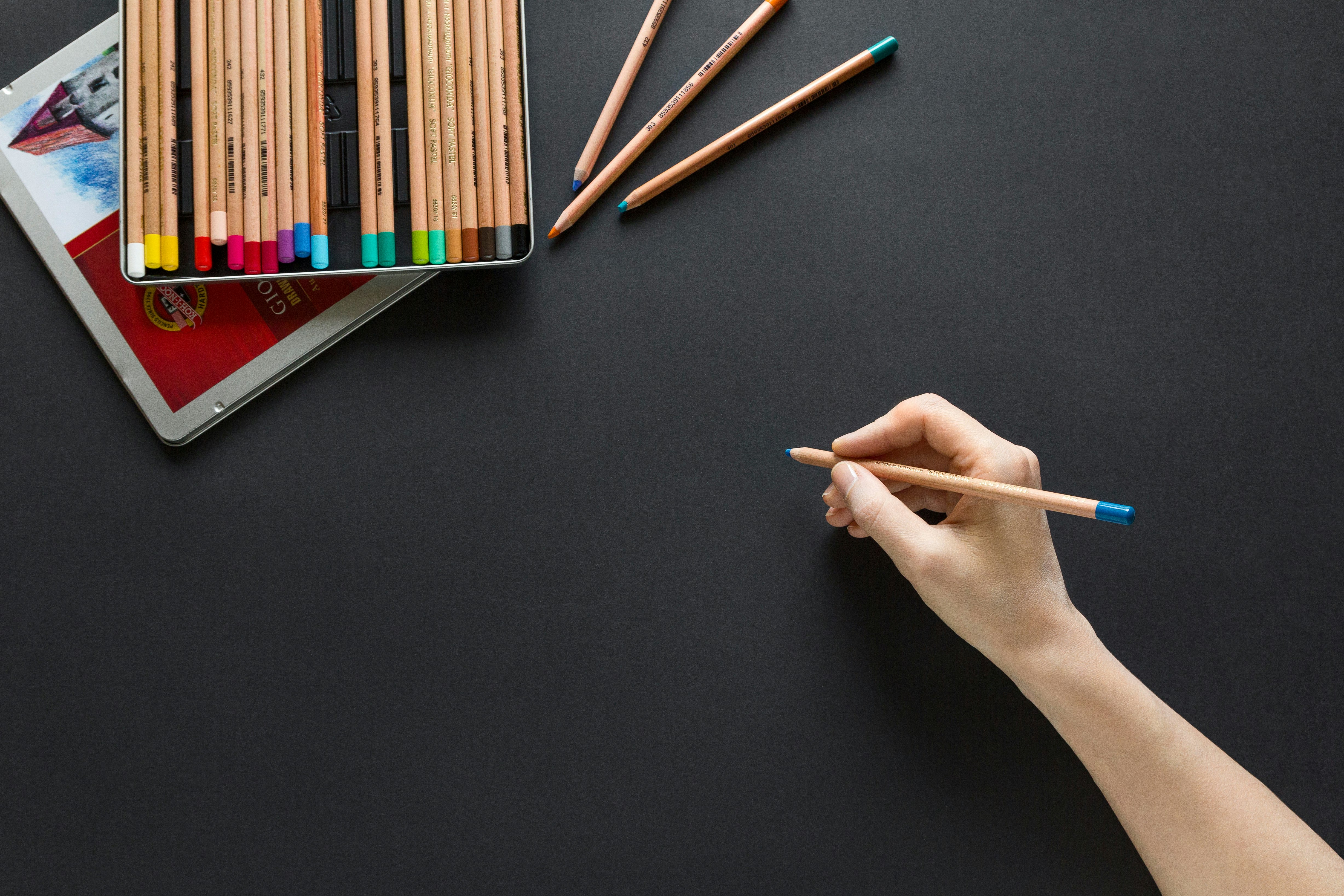
But any logo you want to create a mug that people will easily remember. Sketching is the most important part of a logo design process. It's literally the foundation of any design. After I finished my mood boarding, I like to start sketching ideas on paper by mind-mapping and mood boarding. A lot of ideas is parking ahead. In many cases, they're also inspired curved shapes, layouts, and other elements. I prefer to use a notebook, but you can use any digital apps like Procreate. You could divide a logo into three formats. A logo type, for example, the Disney logo, a logo mark, the sous chef, Nike, and accommodation mark, which is a combination of the logo type and the logo mark. For example, the Airbnb logo. I'd like to start with the name of the brands, So I lay out Keq is creative club. I first started with left alignment. And since kiki and club a vote for lettuce, eat, I'll also try a center alignment which might look good. I'll also try and align them inside a circle. Since it's a three-letter word kiki, scared if club, I think left alignment would work best.
Next, I'll try combining the key and IIE and make a monogram. Now, monogram is basically combining two or more letters to form a unique design. I'll try a few more iterations of this. Maybe the lines of the key, maybe I'll extend the lines of the eye. I haven't interesting idea for a simple icon. Again, just trying a lot more variations on this. The dot of the, I could act as the head of a person and the body of the eye could represent the body. I'll try and design something with very basic shapes just to keep the whole mark very minimal and easy to understand. I'm going to try a few more variations of these very basic shapes and try and combine them in interesting ways. Once I feel like I've sketched enough concepts, I'll take a photo of it and upload it to Illustrator. So Illustrator is a vector-based software, whereas Photoshop is a pixel based software. Any other vector-based software is ideal for creating a logo.
So what happens in a vector-based software is no matter how much you zoom in, it will not pixelate because it's smallest unit is not pixels this vectors. Whereas if you're designing a logo into Photoshop, it will easily pixelate once you zoom in. If it's your first time using Illustrator, don't feel intimidated by all these tools. All you need to know it just four or five of them. You can use the presets that's provided to you, or you can create a new file using this button here. I'm going to name my file. When I use the letter template, you can use whichever template you want. Now once I have my art board open in front of me, I'll drag in the photo here. I've cropped this individual sketches from my photo and I'll work on them one by one. I usually vectorize two to three sketches just to
have a better understanding of the concepts that I've sketched. I first take the sketches and reduce the opacity to about 30%. This helps me trace over the sketch that I've made. I like to break all my sketches into individual basic shapes. And you can make those shapes using the ellipse tool, the rectangle tool, or the Polygon tool. In this case, start with first four basic shapes. I first started with sketching two of my concepts that I really liked. I basically traced over the sketches that I've done. And then I went on to just play along
with the shapes and vectors and create a few more iterations. So I played around with the size of the shapes, moved around the shapes a bit. I liked the first concept. So I also liked the second concept that represented a man walking. So I thought maybe there was a most subtle way to kind of integrate this concept in the first logo. Basically, I merged the first two concepts to try and create a look that was unique and also kind of tied back to the co-working space nature. I played around with the shapes. I integrated a star, which I wanted to add a little bit of magical element because it was too serious. That's how I came up with these four to eight concepts that I want to show it to my client. So one of the reasons I worked entirely in black and white is because I don't want color too influenced by design choices. Good color could easily hide a bad design choice. So I want to have a more unbiased approach towards the vectors I'm creating.
Designing a logo is not a linear process, so don't hesitate To go back to sketching and try some new concepts. You can even fall back to mood board, look for some new inspirations or research a bit more to come up with new ideas. New fresh ideas come from the unlikelihood of sources. So be open to getting feedback from people around you. After getting feedback on dehydration, I felt the need to improve on it. A new concept struck me that I wanted to sketch out. One of the concepts that are really liked from the previous design was using a star to represent the magical element of Keq is creative club. That's what I carried forward and used it as a base from a new design.
This is a more symmetrical shape. That's why I didn't really trace it and said, I did it directly on illustrator because I feel it's more accurate. Next, I duplicate it and wrap them around the star to give a sense of community. So to duplicate this shape around the center, what I did is add a very small circle at the end of the shape and grouped it together. So then I'll go into Effect, distort and Transform, and then click on Transform. I'll set the angle to 360 divided by the number of copies you want.
In my case, it's five. You can use this trick to create as many duplicates as you want around the center. I made a few more iterations. I played around with the shapes, the spacing, the sizing. And instead of five, I tried grouping 34 together. And I felt was a little more sober and modern. And it aligned with the look that I was trying to create for Kiki creative club. I think I'm more or less satisfied with their designs that have now. Next I want to take these two designs and finalize them by adding colors and epigraphy. Your student exercise for this lesson is to start digitizing your logos.
Polishing
- In this lesson, I'll be adding colors and typography to the designs I've shortlisted. So I started by using colors from the movie poster that I had saved during the research process. I bought in the movie poster from the melanoma board onto my illustrator and copied the colors using the eyedropper tool. The colors of the post of a very contrasty and complimented each other. Since there are a lot of elements in the logo, I wanted to try a lot of variations of colors in there. So at first I would call him only one of the elements blue. Then I moved on to coloring two of the elements blue. And then I tried filling 00:35 the entire logo with blue and using red as a background. 00:49 In a similar fashion, I tried a lot more variations with the red and blue and the blue and red, and also with this off-white color, if you confuse it, which color to pick, you can always use color psychology as a guide. Color psychology basically talks about how every color is associated with a feeling. He gets creative club is all about creative professionals and the growth. And that's all I wanted to use green because it's often associated with the word growth. I don't want to use a generic green, so I'm going to play around and move it a little towards blue. I'm always happy with the color, but I also want to try gradient because I feel it will greatly amplified the logo. 01:27 I would try a few more variations with the colored background. You can try as many colors as you want and see what works for you. Since you're walking on a combination mark, I'll go ahead and look for fonts. That best thing with the mark. I'm trying a couple of fonts here. I feel like a geometrical font will work best. That's what I'm going to try first and see how it looks. Next, I'm going to try a more condensed font and see how it looks. 02:02 I'll also try a more extended font. Maybe I should try them all handwritten style. Now. 02:20 I really like how it's come out and I feel will make a really cool logo for Keq is creative club. Now if this was a real client, what I'll do next is make a presentation of the logo and provide assets like colors and typography to them, docile index size for this lesson is to add colors and typography to your logo and finalize it.
⚠️Disclaimer: All the screenshots, materials, and other media documents used in this article are copyrighted to the original platform or authors.